

Best Vintage Printed Carpet Styles to Elevate Your Living Space
2026-09-21
Faded floral medallions. A hint of distressed patina. There’s a reason vintage printed carpets keep showing up in the most memorable rooms—they bring the charm of a flea-market find without the fragile fibers or five-figure price tag. And thanks to modern printing techniques, today’s versions offer richer detail, softer palettes, and sizes that actually fit real living rooms. At Senseco, we’ve seen how the right vintage rug pattern can anchor a sofa, warm up hardwood floors, or turn an awkward corner into a conversation spot. Below, we’re breaking down the vintage printed carpet styles worth considering—and how to make each one feel like it’s been part of your story for years.
Timeworn Persian Rugs for a Living Room With History
A living room gains a quiet authority when the rug underfoot already carries decades of footfall. Timeworn Persian pieces—whether a faded Heriz or a softly abraded Tabriz—bring a sense that the room wasn't assembled in a weekend. The low pile reveals knots and warp, while sun-bleached madder and indigo shift into hues no new dye can replicate. These rugs don't shout; they settle.
The beauty of a worn Persian rug lies in its repairs and irregularities. A patch here, a re-knotted border there, an abrash band where the weaver switched dye lots—each mark is a record of use and care. In a living room, this means the floor becomes less of a backdrop and more of a conversation: guests ask where it came from, and the answer usually involves a village, a family, or a long journey.
Styling with timeworn rugs rewards restraint. Let the muted palette guide the room's textiles—linen slipcovers, unlacquered brass, a dark wood coffee table—so the rug's faded geometry stays central. Because the surface already shows wear, new scuffs and spills won't ruin the mood; they'll join the story the rug has been telling for generations.
Turkish Kilims in Sun-Faded Hues That Feel Like Heirlooms
The first thing you notice is the color—soft apricot, dusty rose, and a blue that has surrendered to the sun. These kilims carry their age in the most graceful way, each faded band and mellowed motif telling of decades spent near windows and under foot.
Unlike newly made pieces that demand attention, these rugs settle into a room like a memory. The wool has softened to the touch, the edges have relaxed, and the patterns have blurred just enough to feel personal rather than perfect. They are the kind of textiles that make a space feel inherited, even if you just brought them home.
Collectors often say that a kilim's beauty deepens once the sharpness of its original dyes fades. What remains is a quieter palette—one that works with old wood, linen sofas, and morning light. It's no wonder these pieces are handed down, not because they are fragile, but because they hold stories better than most objects.
Moroccan Lattice Prints With a Traveled, Lived-In Air
There’s something quietly transporting about Moroccan lattice prints when they carry the soft, sun-faded patina of years spent moving through souks and seaside towns. The geometric interlacing—once crisp and architectural—softens into a rhythm that feels less like decoration and more like memory. You can almost trace the hands that wove the original patterns, the dust caught in the carved wood screens, the salt air dulling the dyes just enough to make each diamond and star feel personal. These aren’t reproductions of a motif; they’re echoes of a particular kind of wandering, where every wrinkle and worn edge tells you the cloth has lived somewhere real.
What sets these pieces apart from the typical boho-luxe look is that the print doesn’t shout for attention. The latticework sits low against linen or slubbed cotton, its lines slightly irregular, its palette drawn from clay rooftops, indigo shutters, and unbleached wool. You might find a faded terracotta trellis crossing a cream ground, or a deep teal grid that’s been washed until it resembles old tilework seen through heat haze. The effect is lived-in without being shabby—more like a favorite jacket you bought in Marrakech a decade ago and still reach for because it understands your body and your pace.
Styling these prints is less about matching a trend and more about layering stories. A lattice-print throw over a cane chair instantly gives the room a traveler’s nonchalance. A tunic in a bleached-out zellige pattern works as well with raw denim as it does with a cotton sarong. The key is to let the print be the quiet narrator—not a bold graphic, but a whisper of geometry that has been softened by time, touch, and distance. When a Moroccan lattice looks like it has already journeyed, it invites you to continue the trip.
Retro Floral Carpets to Soften Modern Edges
There’s a quiet rebellion happening in contemporary interiors, and it’s underfoot. While sleek concrete floors and sharp-lined minimalist furniture dominate the modern aesthetic, retro floral carpets are sliding in as the perfect counterweight. Their faded blooms and meandering vines don’t just sit on the floor—they anchor the room, pulling the eye downward and easing the cold precision of glass and steel. The pattern acts like a visual exhale, breaking up hard geometry with organic curves that feel gathered from a grandmother’s attic rather than a showroom floor.
The trick is in the tension. Pair a faded rose or daisy motif with a stark white sofa or a black metal coffee table, and suddenly the room feels lived-in rather than staged. The carpet’s worn palette—muted terracottas, dusty blues, washed-out greens—softens the contrast between sharp corners and bare walls. It’s not about turning back the clock; it’s about letting a bit of nostalgia round out the edges that modern design leaves too raw. Walk across one, and the soft pile underfoot becomes a reminder that comfort and character can still coexist with clean lines.
Geometric Vintage Rugs for Rooms That Refuse to Match
A room that refuses to match doesn't need a rug that plays it safe. Geometric vintage rugs thrive on that tension—their sharp angles and faded palettes give every clashing color or mismatched chair a common thread. Whether it's a worn Turkish kilim with diamonds or a 70s op-art piece in burnt orange, the pattern acts like a visual anchor without shouting for attention.
The beauty of these rugs is how they borrow from the past to solve a very modern decorating problem. You can throw together a velvet sofa, a steel coffee table, and a flea-market armchair, and a vintage geometric rug will make the whole arrangement feel intentional. The geometry repeats just enough to create order, while the faded dyes and irregular hand-knots keep it from feeling rigid.
Unlike a solid rug that might disappear into the chaos, or a bold new rug that could compete with it, a vintage geometric piece sits right in between. It has history, so it doesn't look like you tried too hard. It has pattern, so it pulls disparate elements together. That's exactly why it works in rooms that refuse to match—it lets the mismatches breathe while quietly tying them into a story.
Oriental Medallions as an Understated Focal Point
Oriental medallions have a quiet way of holding a room together without shouting for attention. Unlike large-scale murals or bold geometric prints, a medallion motif drawn from Persian, Ottoman, or East Asian textile traditions sits somewhere between ornament and architecture. When placed on a single wall, a runner, or even a pair of cushions, it gives the eye a place to rest while the surrounding palette stays muted. The key is restraint—choose one medallion element and let it repeat softly, rather than scattering several competing patterns.
What makes this approach work is the contrast between intricate linework and plain, matte surfaces. A medallion rendered in faded indigo or dusty terracotta against a warm plaster wall feels less like decoration and more like a found artifact. It draws people closer without dominating the conversation. Pair it with raw linen, unlacquered brass, or a low wooden bench, and the medallion becomes the room's quiet anchor—a detail you notice on the second visit, not the first.
In spaces where symmetry is already present, a central medallion can reinforce balance without feeling stiff. In more casual rooms, it can be off-center or partially cropped, as if it belongs to a larger story. Either way, the goal is the same: a focal point that whispers instead of announces.
FAQ
The main difference comes down to construction and age. A genuine antique rug is hand-knotted or hand-woven decades ago, often with natural dyes and visible wear. A vintage printed carpet is a modern piece that uses printing techniques to recreate those faded, distressed patterns on a flatwoven or low-pile base. It gives you the old-world look without the fragility or the five-figure price tag. You can spot them by checking the back—printed carpets usually have a crisp, uniform design on the reverse, while true antiques show knots or weaving irregularities.
Absolutely, and it's one of the easiest ways to add warmth to a space that feels too cold or sterile. The faded, worn-in look softens sharp lines and modern materials like glass, metal, and polished concrete. The trick is to stick with a more subdued pattern or a limited color palette—think muted terracottas, dusty blues, or washed-out greys. A bold, oversized floral or medallion print can work, but keep the rest of the room's textiles fairly minimal so the carpet becomes the anchor rather than competing with everything else.
I'd say the trend is moving away from the extremely distressed, almost ghost-like patterns that were everywhere a few years ago. Right now, people are drawn to smaller-scale Persian or Anatolian motifs with a slightly faded but still legible design. Also, Swedish flatweave-inspired prints with simple geometric borders and soft, chalky colors are getting popular because they feel lighter and less busy. Avoid anything that looks like it's been through a digital blur filter—the most convincing prints have subtle irregularities, like slight asymmetry or uneven fading, rather than a perfectly uniform distress.
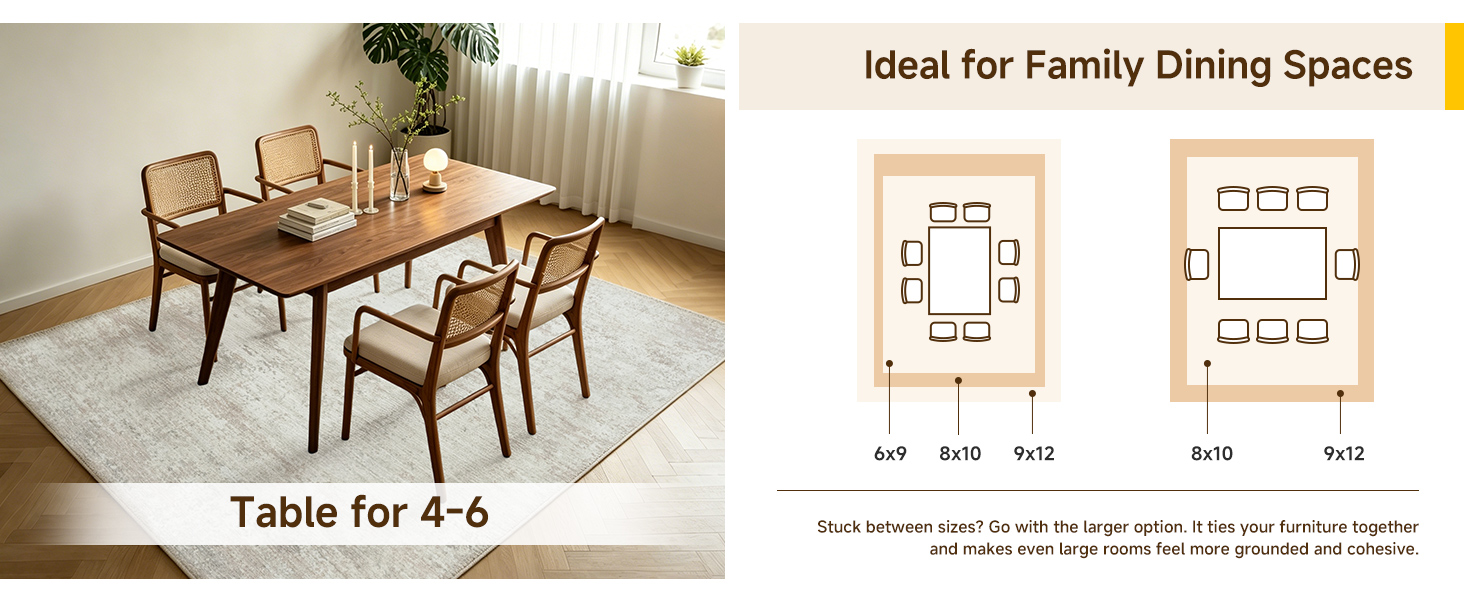
The common mistake is going too small, which actually chops up the room visually. For a compact living area, aim for a rug that lets at least the front legs of your sofa and chairs sit on it, even if that means an 8x10 in a modest space. If the room is very narrow, a runner-style vintage print placed horizontally can widen the feel. Also, look for patterns with an open field or a border that's not too heavy—busy all-over designs can make a small room feel busier. And don't be afraid to let the rug almost fill the seating zone; a little breathing room around the edges with the floor visible is enough.
These carpets are generally low-maintenance, but printed colors can be sensitive to strong sunlight and harsh cleaning. I'd suggest rotating the rug every few months if any part of it gets direct afternoon sun—that prevents uneven fading. For regular upkeep, vacuum with a suction-only attachment or a brushless head; beater bars can rough up the printed surface. Spot-clean spills immediately with a mild detergent and cold water, and blot rather than scrub. If you need a deep clean, check the care tag first—many printed carpets are fine with a gentle carpet shampooer, but avoid steam cleaning unless the manufacturer says it's safe, as heat can cause the colors to bleed or lift.
They can be, but you need to choose the right material and weave. Look for a low-pile or flatwoven polypropylene or polyester blend, which resists stains, moisture, and crushing better than cotton or viscose. A printed design on a tightly woven base will hide everyday dirt and pet hair better than a solid color. One caveat: if you have a dog that likes to dig or a cat that claws, the printed pattern can show scratches more than a textured, high-low pile. In that case, go for a busier print with lots of color variation—it's more forgiving. Also, a good rug pad underneath not only prevents slipping but reduces wear from friction on the backing.
If your living room doesn't get much natural light, lean toward carpets with a lighter field color—ivory, sand, or soft beige—rather than dark navy or deep burgundy. Washed-out pastels like blush, sage, and pale gold can reflect light and make the space feel airier. Avoid heavy, high-contrast black-and-red designs, which tend to absorb light and close in a room. Also, a vintage print with a subtle sheen or a slightly lustrous fiber (like a viscose blend) can bounce a bit of light around, but keep it subtle—too much shine looks cheap.
You can, and it's a great way to add depth without committing to a full floor replacement. If layering over wall-to-wall carpet, choose a vintage printed rug with a flatweave or low profile so it doesn't bunch or create a tripping hazard. For layering over another rug, like a large neutral jute or sisal, pick a vintage print in a smaller size that contrasts in texture—the smooth printed surface against the rough natural fiber looks intentional and cozy. Just make sure the bottom rug is larger by at least a foot on all sides, and use a non-slip pad between them to keep the top rug from sliding.
Conclusion
There’s a particular kind of warmth that only a faded pattern can bring to a room, and vintage-style printed carpets deliver it without the fragility of a true antique. Timeworn Persian looks carry a quiet sense of history, their muted reds and blues making a living room feel settled rather than decorated. Beside them, Turkish kilims in sun-faded terracotta, sage, and dusty rose read like heirlooms passed down through generations, even when they’re fresh off the loom. Moroccan lattice prints add another layer—they bring a traveled, lived-in air that works just as well under a coffee table as it does in a reading nook. Together these pieces create a foundation that feels collected over time, not arranged in a single afternoon.
For rooms that need a softer counterpoint, retro floral carpets break up sharp modern lines with loose, unpolished blooms that never feel fussy. If your space leans eclectic, geometric vintage rugs are the ones that let mismatched furniture make sense—they anchor the chaos without asking anything to match. And when you want a focal point that doesn’t shout, Oriental medallions in washed-out indigo or faded garnet do the job with restraint. The beauty of these printed styles is that they don’t demand perfection. They invite bare feet, morning light, and a little everyday mess, which is exactly what makes a living space feel elevated in the first place.
Contact Us
Contact Person: Ivy Yin
Email: [email protected]
Tel/WhatsApp: +86 18519681805
Website: https://www.sensecomarketing.com/